Analysis of neurophysiological signals#
Learning Outcomes#
learning goals
This assignment supports your progress toward the following course learning outcomes:
You can analyse extracellular recordings of insect neurons (cockroach and cricket).
You can write a concise report describing your analysis and findings.
You will learn how communication within the nervous system via action potentials can be measured and analysed. At the end of this module, you will be able to:
Understand how extracellular neural signals are recorded, filtered, and digitised
Describe a simple neuro-biophysical (linear) model that explains how multiple neurons contribute to a noisy measured signal
Detect, extract, and sort spikes from raw recordings
Use Singular Value Decomposition (SVD) to reduce spike waveform dimensionality
Perform cluster analysis to separate spikes from different neurons
Analyse spike-train statistics (ISI histograms, CV)
Compute and interpret spike-density functions and power spectra
Apply all steps of the analysis pipeline directly in MATLAB using the provided routines
Enumerate and describe the essential components of spike-train analysis:
Sampling and filtering
Noise estimation
Spike detection
Spike waveform extraction
Spike sorting and identification
Background#
Neurons communicate using brief electrical impulses called action potentials or spikes. Extracellular recordings allow us to measure these spikes non-invasively, but the signals are noisy, filtered, and often contain activity from several neurons at once. Extracting meaningful information from such data is therefore both challenging and central to neurophysiological research. Understanding how to detect, sort, and analyse spikes provides insight into how nervous systems encode and process information.
Scope of this assignment#
In a previous practical, you recorded neural activity from mechanoreceptors in an insect leg using the Spikerbox from Backyard Brains. These signals were saved as digital .aif audio files using Audacity. Such recordings typically contain clear action potentials mixed with background noise and signals from multiple neurons.
In this practical you will:
Load these recordings into MATLAB
Visualise the raw neural signal
Detect spike events
Extract and compare spike waveforms
Sort spikes originating from different neurons
Analyse the timing and frequency content of the resulting spike trains
You will work with two example datasets (cricket and cockroach) and then repeat the analysis on your own recording. Results should be compared across datasets in your final report.
Duration#
Expect to spend 2–4 hours on this practical and the accompanying written report, depending on your familiarity with MATLAB.
Products#
You will produce a brief report. The brief report should contain all figures produced (with correct labels and legend/caption) and answers to the questions and exercises.
Data#
Downloads#
Download the data files:
Download the Matlab files:
Research Data Management#
Create a main folder called NBP_spike.
Inside this folder, create three subfolders:
data
analysis
figures
Store the data files in the data folder. Extract the matlab files, and store them directly in the analysis folder. Then create a new MATLAB script named data_analysis.m and save it inside the analysis folder.
For more information, see Research Data Management.
Raw Extracellular Signals#
We begin by loading the electrophysiological recordings into MATLAB using the function audioread:
fname = fullfile('..','data','Cricket.aif'); % the filename, including path, and correct file separators
[pt,fs] = audioread(fname);
The function audioread returns:
pt – the measured signal \(p(t)\) (the pressure signal as picked up by the microphone of your computer, smartphone, or other recording device), expressed as (arbitrary) amplitude values
fs – the sampling rate \(f_S\) (in Hz)
These values have the following meaning:
The entries in pt represent the instantaneous amplitude of the signal at successive time points, or samples.
The spacing (in time) between those samples is determined by the sampling interval
For the typical audio sampling rate of 22,050 Hz (i.e. 44.1 kHz for a stereo signal),
Thus, the numerical sequence in pt forms a discretised, time-resolved representation of the underlying extracellular voltage fluctuations measured during the insect recording.
Note
You can play the sound using:
soundsc(pt, fs);
(Use headphones or low volume!)
Electrophysiologists often listen to their signals while searching for neurons.
For example:
In the superior colliculus, you can hear bursts associated with eye movements.
In the inferior colliculus or other auditory structures, the spikes may sound like the stimulus itself. A fun demonstration: survivor in the medial geniculate nucleus
question - number of samples
Calculate the total number of samples in this signal.
Plotting the Raw Signal#
You can visualise the recording with:
figure(1);
clf;
plot(pt)
xlabel('sample index');
ylabel('amplitude');
title('Raw extracellular signal');
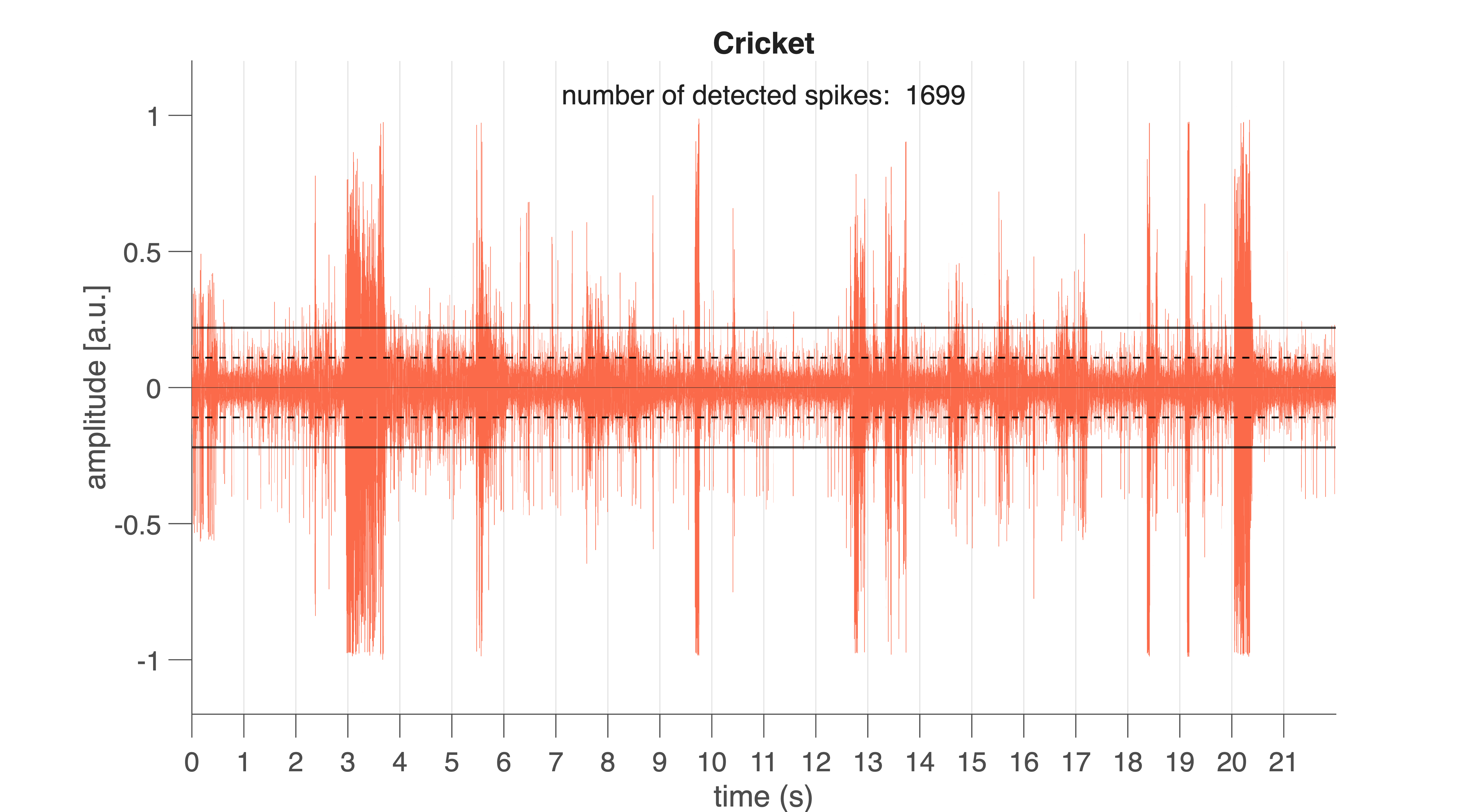
Fig. 30 Raw neural signal from the cricket (Cricket.aif). Vertical lines mark 1-s intervals. Black horizontal lines indicate the spike detection threshold. Black dotted lines show the noise level (±1 SD).#
For convenience, a more advanced function is provided: spike_plotraw.m (producing the graph seen in Fig. 30). This function:
loads the
.aiffileplots the raw signal
computes the noise level (standard deviation)
sets a spike detection threshold
counts spikes exceeding the threshold
figure(2);
clf;
nSpk = spike_plotraw(fname, 2);
If all goes well, you will see something like Fig. 30. Vertical lines indicate 1-s intervals. Horizontal lines mark the noise level (±1 \(\sigma\)) and the detection threshold (here: \(2\sigma\)).
Extracellular spikes appear as sharp peaks rising above the noise band. Spikes differ in amplitude and shape because multiple neurons contribute to the recorded signal (you will analyse this later).
question – action potential shape
If action potentials generated by a single neuron are stereotyped (as in Fig. 21), why do the spike shapes and amplitudes in this recording differ so strongly?
Detection Threshold#
The MATLAB program spike_plotraw detects spike whenever the signal rises above the spike detection threshold. This detection threshold is defined as a multiple of the noise standard deviation (SD). In the example above, a threshold of 2×SD was used. Every deflection that exceeds this level for at least 0.6 ms is classified as a spike candidate. The program also counts the number of spikes detected in this way; the total number of detected spikes is shown in the plot and returned as the function output.
exercise – detection level
Before detecting and analysing spikes, it is crucial to understand how sensitive extracellular recordings are to the choice of detection threshold. Because the threshold is defined as a multiple of the noise level, a lower threshold will detect more events—including false positives—whereas a higher threshold risks missing real spikes. This exercise helps you explore this trade-off and develop intuition about how threshold selection affects spike counts, spike quality, and ultimately all downstream analyses such as spike sorting and ISI measurements.
To complete the exercise, you may either write your own MATLAB (or R, or Python) code or use the provided code block (if you choose for the latter, please try to understand the given code).
Vary the detection level from 1.5 to 5.0 in steps of 0.5.
Plot how the number of detected spikes per second depends on the threshold.
Repeat this analysis for both datasets
and compare the patterns you observe.
%% Determine number of spikes detected
fname1 = fullfile('..','data','Cricket.aif');
fname2 = fullfile('..','data','Cockroach2.aif');

lvl  = 1.5:0.5:5;
nlvl = numel(lvl);
Nspk = NaN(2,nlvl);

for ii = 1:nlvl
    figure(3)
    subplot(2,4,ii);
    Nspk(1,ii) = spike_plotraw(fname1, lvl(ii));

    figure(4)
    subplot(2,4,ii);
    Nspk(2,ii) = spike_plotraw(fname2, lvl(ii));
end

figure(5); clf;
plot(lvl, Nspk', 'o-', 'LineWidth', 1.5, ...
     'MarkerFaceColor', 'w', 'MarkerSize', 15);
xlim([1 5.5]);
ylim([-100 3000]);
xlabel('Detection level (\sigma)');
ylabel('Number of spikes detected');
legend('Cricket','Cockroach')
The raw signal you see is an extracellular multi-unit recording. This means the electrode does not isolate a single neuron: instead, it records a weighted mixture of voltage contributions from several nearby neurons, each shaped by the tissue, distance to the electrode, and the filtering properties of the recording hardware.
exercise – linear model
Construct a linear model describing how action potentials from multiple neurons (e.g. as in Fig. 21) combine to produce the final measured signal shown in Fig. 30.
Try to sketch or write down the model yourself before opening the hint below.
Hint
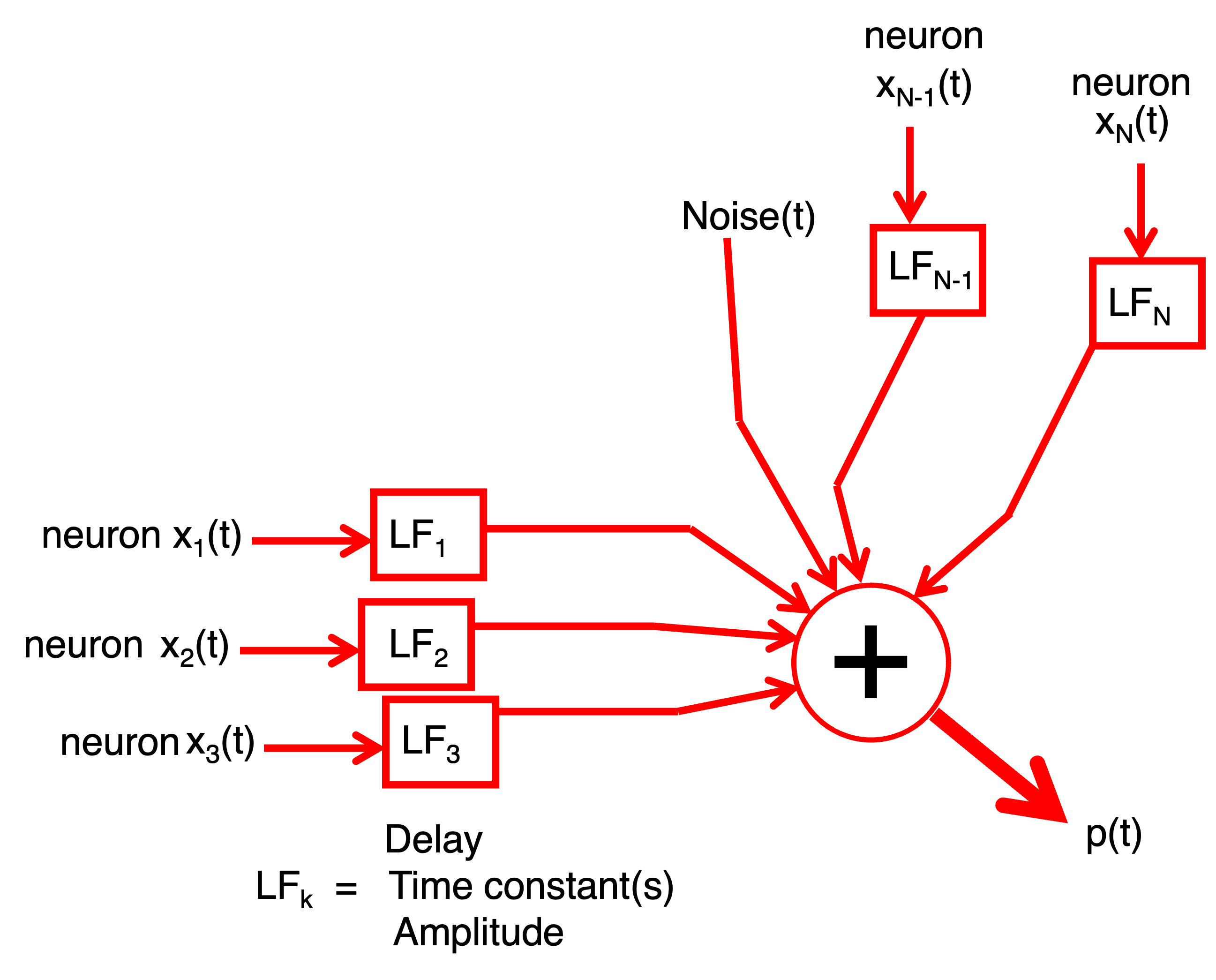
Fig. 31 Hint.#
Your model should express the recorded signal as a weighted sum of the underlying spike waveforms plus noise. Think about:
how each neuron contributes its own stereotyped spike shape,
how these shapes may be scaled or filtered,
and how noise enters the measurement.
Spike Detection#
Once the raw signal is loaded and visualised, the next step is to extract individual spikes. Accurate spike detection is essential: downstream analyses — such as inter-spike interval (ISI) statistics, spike sorting, and frequency analysis — rely on a clean and complete list of spike times. Extracellular recordings contain contributions from multiple neurons plus noise, so detecting spikes requires a method that is sensitive to real events while robust against false detections.
Theory: How Do We Detect a Spike?#
We estimate the noise level using the standard deviation of the full signal:
A spike is detected whenever the signal exceeds a chosen multiple of the noise level for a minimum duration (0.6 ms):
\(\theta\) is the detection threshold (e.g., 2, 3, 4 × \(\sigma\)).
Larger \(\theta\) → fewer spikes detected (fewer false positives).
Smaller \(\theta\) → more spikes detected (but more noise counted as spikes).
Detected spikes can be represented as a point process:
with \(N\) the number of neurons that produced the spikes, \(M_n\) the number of spikes \(M\) that neuron \(n\) produced , and \(\tau_m\), the moment of spike \(m\) from neuron \(n\).
exercise – total number of spikes
Write a formula for the total number of spikes detected across the entire recording.
How does increasing \(\theta\) influence this number?
Extracting Spike Waveforms#
Each spike waveform \(s_{m,n}\) is extracted by taking a short window \(W\) around its peak:
\( t_1 = -0.15 \) ms
\( t_2 = +0.85 \) ms
Window duration = 1 ms
The windowed waveform is:
with:
exercise – windowed signal
Verify that this window function extracts exactly the 1-ms segment around each spike.
Each row of the spike-waveform matrix contains one windowed waveform.
Detecting Spikes in MATLAB#
Use the function spike_detect:
close all;
fname = fullfile('..','data','Cockroach2.aif');
[spikeTime, spikeWave, spikeFs, spikeNoise] = spike_detect(fname, 3.3);
This function:
Splits the recording into 1-s trials
Detects spikes
Stores:
spike times (samples and ms)
spike waveforms
sampling rate
noise level
and plots the trace and detected moments (Fig. 32) and spike waveforms (Fig. 33).
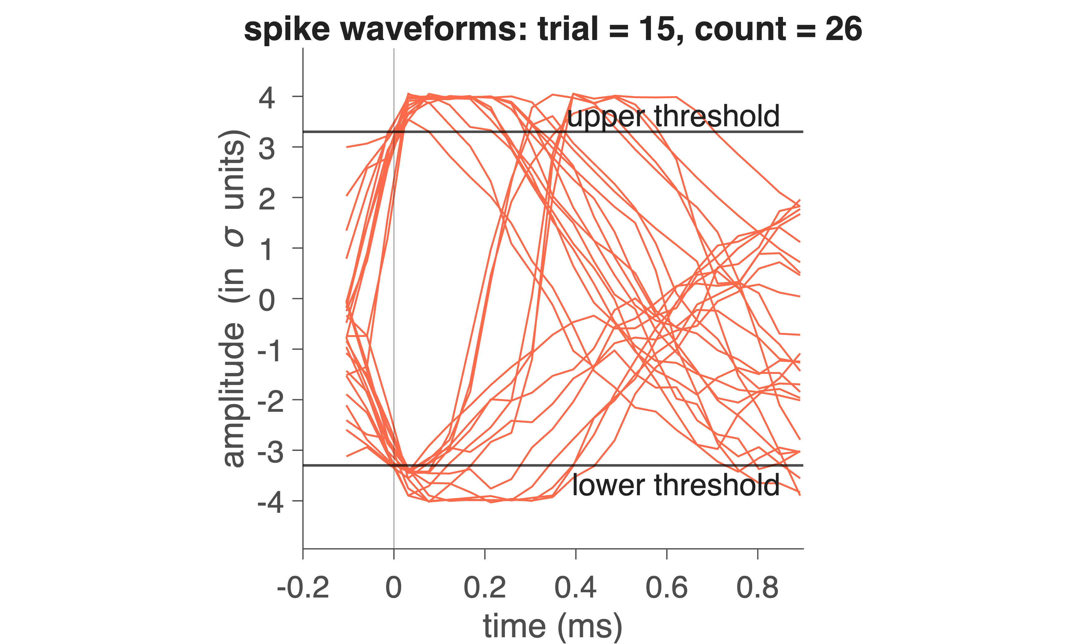
Fig. 32 Red trace indicates electrophysiological trace for 1 trial (1 s). On the bottom, the detected spike moments are indicated by pulses.#
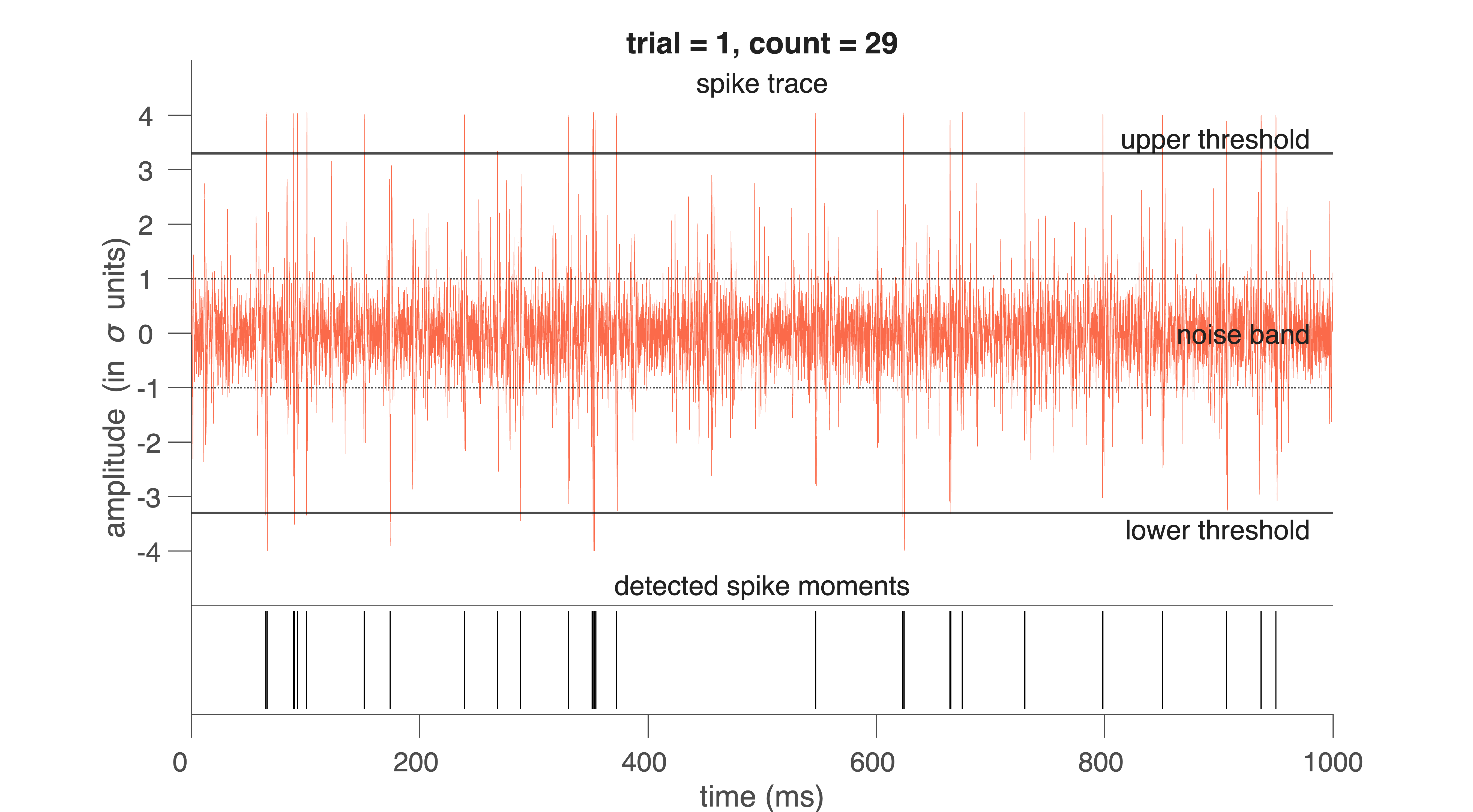
Fig. 33 Red traces indicates waveforms of individual spikes for 1 trial (1 s).#
Exploring the Output#
spikeTime is a table with one row per detected spike:
spikeTrial: which 1-s trial the spike occurred in
spikeNr: which spike number within the trial
spikeSample: sample at which the spike occurred
spikeMoment: time in ms (computed as spikeSample / spikeFs * 1000)
Example:
a = spikeTime.spikeMoment(1:20)
b = spikeTime.spikeTrial(1:20)
These commands show when the first 20 spikes occurred and which trials they belong to.
spikeWave is a matrix in which each row is a windowed spike waveform:
spikeWave(1,:)
This returns the sample values for the first detected spike. You can match it with its metadata using:
c = spikeTime(1,:)
The other two outputs of the program are:
spikeFs - the sampling rate of the measurement, which will be 22.050
spikeNoise - the standard deviation of the total spike signal (capturing much of the noise)
In this way all information about the detected spikes is available for further analysis. The spike wave forms can be used to apply singular value decomposition and then cluster analysis.
exercise – detection level
With the next MATLAB code:
Choose a fixed \(\theta\) (e.g., 3.5) and detect spikes for all available datasets.
Determine the spike waveforms for each dataset in separate variables.
And then compare waveforms.
Note: not all figures have to be shown. Figures for one trial will suffice.
close all;

fname1 = fullfile('..','data','Cockroach2.aif');
fname2 = fullfile('..','data','Cricket.aif');

[spikeTime1, spikeWave1, spikeFs1, spikeNoise1] = spike_detect(fname1, 3.5);
[spikeTime2, spikeWave2, spikeFs2, spikeNoise2] = spike_detect(fname2, 3.3);
Conceptual Question – false positives vs. false negatives
Describe what a false positive and a false negative spike detection would look like in these data.
For each of the following, explain the consequences for later analyses (ISI, SVD, clustering):
\(\theta\) set too low
\(\theta\) set too high
Common Mistakes in Spike Detection
Using too short a clipping window
→ spike waveforms are truncated, making spike shape comparisons unreliable.Setting \(\theta\) without inspecting the raw signal
→ thresholds may be inappropriate for noisy or quiet recordings.Forgetting that noise level varies across recordings
→ \(\theta\) = 3 is not “universal”; each file has its own σ.Not converting sample index to time
→ leads to incorrect ISI values and misinterpretation of spike timing.Overplotting without clearing figures
→ makes it appear as if more spikes were detected than actually were.
Spike Sorting#
Once spikes have been detected and their waveforms extracted, the next question is: Which spike came from which neuron? Extracellular recordings contain mixtures of activity from several nearby cells. Each neuron generates a stereotyped spike shape, but different neurons often produce different spike shapes due to electrode geometry, tissue filtering, and relative distance to the electrode. Therefore, spike sorting is about using differences in spike waveform shape to classify spikes and assign them to distinct neurons. To do this, we first perform data reduction using Singular Value Decomposition (SVD).
Singular Value Decomposition (Theory)#
Each detected spike waveform in spikeWave is a short snippet of the raw signal — for example, a vector of 25 samples representing a 1-ms window. If you detected 5000 spikes, your spikeWave matrix contains:
5000 rows (spikes)
25 columns (samples per spike)
→ 125,000 total data points
We now want to express each spike as a weighted combination of a small number of basis functions.
Why SVD?#
You may have learned (in Signals) that signals can be expressed as a superposition of basis functions:
a sum of Dirac impulses: \(x(t) = \sum_{n=-\infty}^{n=+\infty} \delta(t-\tau_n)\)
a sum of sinusoids: \(x(t) = \sum_{n=0}^{n=+\infty} a_n \cdot \cos{(n\omega t + \phi_n)}\)
but neither basis resembles the shape of a neural spike waveform \(x(t)\). Therefore, we often need a lot (\(\infty\)) of them to approximate an arbitrary signal accurately. SVD instead learns a set of basis functions that resemble the spike waveforms: eigenvectors that are optimally suited for representing the spike waveforms in your dataset. These are (in contrast to the pulses and sines) different for each signal \(x(t)\), but we also need much less of it to build up (reconstruct) the signal.
These eigenvectors:
are derived from the spike data itself
form an orthogonal basis
are ordered by importance using their singular values
Thus, the first few eigenvectors capture the meaningful structure in the spikes, while the remaining ones mainly represent noise.
Decomposition of a spike#
Given a waveform \(w(t)\), sampled at 25 points, SVD yields 25 eigenvectors \(e_n(t)\).
A spike can be perfectly reconstructed as a weighted sum of the eigenvectors:
In practice, only the first 3–5 eigenvectors are needed to reconstruct the spike waveforms accurately (\(>90\%\)):
in which \(\hat(w)(t)\) is the approximation of the actual waveform, \(w(t)\). The weights in these sums (coefficients, \(\alpha_n\)) are computed via an inner product:
These coefficients can be different for each measured wave \(w(t)\), but, importantly: all waveforms coming from one cell will have coefficients close to each other, while they will differ more from each other for different cells.
Interpretation:
Spikes from the same neuron → similar coefficients
Spikes from different neurons → distinct clusters in coefficient space
exercise - data reduction
Show that using only the first 4 eigenvectors reduces the data to 16 % of the original size — with almost no loss of information.
Noise Removal and Ordering of Singular Values#
A powerful advantage of Singular Value Decomposition (SVD) is that it not only produces a set of basis vectors for the spike waveforms—it also tells us how important each basis vector is for representing the underlying neural signal.
When performing SVD on the spike waveform matrix (X), we obtain:
Columns of \(V\) – waveform basis vectors (right singular vectors)
Diagonal of \(\Sigma\) – singular values, always arranged in decreasing order
\(U\) – describes how each spike is expressed in terms of these basis vectors
The singular values satisfy:
Each singular value \(\sigma_n\) indicates how much variance of the spike waveforms is explained by the corresponding basis vector \(e_n(t)\).
Why this ordering matters#
Spike waveforms originating from a single neuron have a highly consistent shape. Noise, by contrast, is:
irregular
uncorrelated across spikes
spread thinly over many dimensions
As a result:
The first few singular values are large, reflecting reproducible structure in the spike shapes.
The remaining singular values decline rapidly, capturing only random noise.
Thus, for typical extracellular recordings:
The first 3–5 singular vectors contain nearly all meaningful information.
Remaining vectors predominantly encode noise.
We can thus reconstruct a denoised version of each spike using only the first \(K\) singular vectors. This produces clean, low-dimensional representations of the spikes that are much easier to cluster.
Interpretation#
Large singular values → strong, consistent spike shape components
Small singular values → inconsistent, noise-dominated variability
By retaining only the components with the largest singular values, we perform an automatic, mathematically principled noise reduction step as part of the spike sorting pipeline.
Practical: Applying SVD in MATLAB#
You now have two (three) spike-wave files, containing the information about the sample number of the spike in the file, and the waveform of that spike. Suppose we have called them spikeWave1 and spikeWave2 (and spikeWav3). We are now going to perform the data reduction analysis via Singular Value Decomposition, whereby the 23 eigen-vectors are calculated with the corresponding 23 singular values. Then we only take the first four eigen-vectors and singular values to characterize all the spikes of the file. In short, each spike will be approximated by the following description:
How good that approximation is can be viewed by calculating the correlation between the real spike and the approximated, reconstructed, spike. This is done on all detected spikes in the spike_svd function. You can call this program as follows:
[v1, eigenVal1] = spike_svd (spikeWave1,spikeTime1);
and
[v2, eigenVal2] = spike_svd (spikeWave2,spikeTime2);
Do this separately as these functions will create figures that replace each other.
The eigenVal1 matrix has Nspikes rows and 7 columns. Every row is a spike, of which
Col 1 = trial nr
Col 2 = Sample nr of the spike in the trial
Col 3 to Col 6 = the 4 highest eigenvalues of the spike
Col 7 = the correlation between spike waveform and its approximation.
In addition to the two matrix outputs, the program also produces four figures. In here are shown: the four eigenvectors as a function of time (Fig. 1), all eigenvalues in decreasing order (Fig. 2), two-dimensional projections of the 4 eigenvalues for all spikes (6 plates in Fig. 3), and the correlations for all spikes (Fig. 4).
exercise - explain SVD
Explain what you see in these figures.
exercise - reconstruction
Do this analysis on the two (three) data files and compare the different eigenvectors with each other. Are the four eigenvectors sufficient to reconstruct the spikes accurately? Pick some spike waveforms of your choice from the files, plot these, and also plot the reconstructed waveform (in the same figure as the original) to convince yourself that this reconstruction is indeed accurate. See also the MATLAB code next.
% Reconstruction
spikeNr = 63;
Spk		= spikeWave1(spikeNr,:);
Val		= eigenVal1(spikeNr,3:6);
v_1		= v1(:, 1);
v_2		= v1(:, 2);
v_3		= v1(:, 3);
v_4		= v1(:, 4);
RecSpk	= Val(1) * v_1 + Val(2) * v_2 + Val(3) * v_3 +Val(4) * v_4;

t = (1:numel(Spk))/spikeFs*1000-0.15;
% Plotting
figure (5);
clf
h(1) = plot(t,Spk,'k-','LineWidth',2);
hold on;
h(2) = plot(t,RecSpk,'r','LineWidth',2);

% Accuracy
r = corrcoef(Spk,RecSpk); % correlation coefficient
r = r(2);


% Nice plot
xlabel('time (ms)');
ylabel('amplitude (a.u.)');
str = ['spike #: ' num2str(spikeNr)];
title(str);
if hasNicegraph
	nicegraph;
	set(gca, 'FontSize', 24);
else
	% Minimal built-in equivalent
	box off;
	set(gca, 'TickDir', 'out', 'FontSize', 24);
end
str = ['r = ' num2str(r,2)];
bf_text(0.1,0.1,str,'FontSize',32)
xline(0);
yline(0);
legend(h,{'Original','Reconstruction'});
You have now plotted the original spike as a black curve, and the reconstructed spike as a red line on the same scale as the black
Why SVD Helps Spike Sorting#
Once each spike is represented by a compact 4-dimensional feature vector:
we can cluster these vectors into groups corresponding to individual neurons. SVD therefore provides:
Noise reduction — higher-order eigenvectors mainly contain noise
Dimensionality reduction — enabling clustering and visualization
You will perform clustering next.
Spike clustering#
If we take the four main eigenvectors to describe a spikes, each detected spike waveform produces a set of four coefficients, [\(\alpha_1\), \(\alpha_2\), \(\alpha_3\), \(\alpha_4\)]. All spikes together thus produce a large point cloud that lives in 4-dimensional space (so each spike is represented as a 4-dimensional vector). In Fig. 34 You can see an example of such a projected one point cloud in the plane.
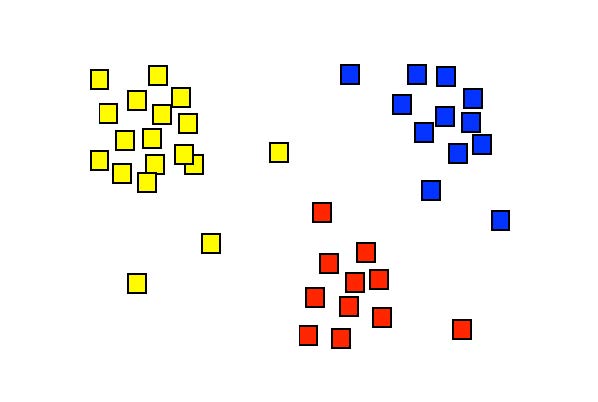
Fig. 34 Display of the singular values \([x, y] = [\alpha_1, \alpha_2]\) for a hypothetical situation. Each symbol here represents the set coefficients of a single spike. The figure suggests that the spikes can be separated into three groups, which are here indicated with different colors. Cluster analysis is a technique that can identify these groups through a mathematical procedure (and can provide a color to each of them).#
Different neurons (‘spikes’) can now be distinguished from each other by dividing this point cloud into so-called clusters. There are computer algorithms that can perform this cluster analysis. Each cluster then corresponds to a single neuron. Smart forms of these algorithms can even determine how many different clusters are actually hidden in the data cloud; in this practical we will use those, but ‘tell’ the spike detection algorithm in advance that it may find a maximum of 3 clusters.
How does cluster analysis work?#
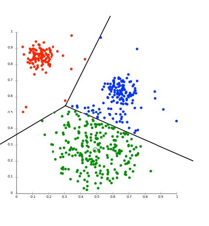
Fig. 35 The result of Cluster Analysis on a cloud of singular values, here projected in two-dimensional plane, e.g. the [\(alpha_1\), \(alpha_2\)] plane. The three lines indicate the optimal separation between the three differently colored clusters of spikes. N.B. the analysis was performed in the full d-dimensional space (typically, d = 3 or 4).#
There are several cluster analysis algorithms, which determine the separation between clusters based on various predetermined criteria. A commonly used method is the K-means cluster analysis. The K stands for the number of clusters that should be searched in the d-dimensional cloud of N data points. It goes like this:
Suppose we have a (large) data set S of N measurements that can be represented by:
In our case, there will be N spikes each with four eigenvalues (4-dimensional). The K-means cluster analysis tries to divide this dataset into K subsets (\(K \leqslant N\)), according to: \(S = (S_1, S_2,..., S_K)\), such that the total summed square distance of all measurement points in each cluster to the average of that cluster is minimal. In formula form:
in which
This minimum is determined by an iterative (i.e., systematic search) procedure. This is illustrated in the figures below (source: Wikipedia).
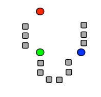
Fig. 36 (a) K initial means (circles) are first randomly chosen within the data set (squares; here: K = 3). (b) The three initial clusters are then determined for each data point by calculating the mean it is closest to. The red cluster thus receives 1 data point, the green one 6 and the blue 5. (c) The centers of gravity of each initial cluster then becomes the new estimate for the cluster means. (d) After many iterations, the final cluster distribution arises (3 in red, 4 in green, 5 in blue). Note that as the initial estimate the blue was assigned to the top right, the final distribution could have turned out differently accordingly.#
Since the procedure of Fig. 36 does not guarantee that you will always find the real global minimum (it depends, among other things, on your initial estimate!), the algorithm is typically repeated a large number of times with new randomly selected initial means. This ultimately leads to a statistical distribution of cluster means. From this, a better estimate of the values (and their reliability) can be determined. There are also cluster algorithms that are not based on the distance from the data points to each cluster mean, but, for example, on the statistical properties of the data cloud. Such techniques may produce more robust and also better clustering results, but it goes too far for this course to discuss this here.
Practical#
In Figure 3 of the program spike_svd you see a six-panel of images in which the four singular values are plotted against each other in pairs (a1-a2, a1-a3, a1-a4, a2-a3, a2-a4 and a3-a4). In some of those pictures it is (possibly) clear to see that the data clouds are more or less separate from each other. The trick of cluster analysis is now to find the optimal dividing lines between the data points in the four-dimensional space of singular values (see lecture). We are going to do this with the program \mcode{nbf_spikeclusters}. As described in the lecture, there are very advanced cluster separation techniques, but applying them requires quite a bit of extra math. Here we limit ourselves to the widely used K-means cluster analysis. We tell the program in advance how many clusters it should find, and then the best possible cluster areas are identified according to the iterative procedure outlined in the lectures.
To do the cluster analysis, type:
[labels1] = spike_clusters(spikeWave1, spikeTime1, 3);
Just like with the SVD routine, the input is the matrix with detected spike waveforms. The second input is the number of clusters that we want (we take here: 3). The program produces six figures. Spikes that belong to a certain cluster now have their own color.
The output of the program is a file, here called: LABELS1. In Matlab this is a so-called ‘structure’, which means that the data storage, in contrast to a vector or a matrix, can consist of entirely different elements (this can be for example pieces of text, whole numbers, real numbers, sets of numbers, etc. etc.).
If you type: labels1{1} you will see the first element of this file, and it gives the total number of spikes that were measured in the three different clusters:
ans = Nspks1: 158 Nspks2: 638 Nspks3: 361.
After this comes the data for the different trials (the 1.000 s segments from the raw data file). In the case of Cockroach2.aif we had 15 trials, so 15 structures now follow. Each structure then provides all data on the spikes of each of the three clusters. They are called respectively: Spike1, Spike2 and Spike3.
For example: to see the data of the spikes from the second cluster of the third trial (i.e. between times 2.0 and 3.0 s) you type: labels1{4}.Spike2. You will see the following:
ans = Trial: 3 Nspikes: 15 Label: [15x1] double Moments: [15x1] double Eigenvalues: [15x4] double Correl: [15x1] double
In this way it is therefore possible to put all possible data together in a well-organized way in one file, and to use it for further analysis.
exercise - reconstruction
Do this analysis on the three data files and compare the different spike forms and clusters with each other. Try to make a figure in which you (a separate figure for each data file) plot the number of spikes of clusters 2 and 3 in each trial against the number of spikes of clusters 1 of that trial. Do you see high (positive / negative) or low correlations? What would that mean?
Save the structures of the two (three) data files, because we now need them to be able to perform the analysis on the selected spike clusters!
Spike Interval Distribution#
Now we will look at the statistics of the spikes. For this we go the sorted spikes (with labels 1, 2, and 3) from the LABELS structure, and we determine the distribution of the interspike intervals (ISI). The ISI for spike nr. k is defined as:
.
With the program spike_interval the intervals for all spikes in a file can be determined and plotted in a histogram with a bin width of 2 ms. The height of the histogram then indicates the number of times that spikes with that ISI were found. Suppose we want to see the spikes intervals for cluster 2.
Then type:
[ISI2, SPK2, DENS2] = spike_interval(labels1, 2);
The input is the structure file with LABELS, and the input ‘2’ indicates that you have the spikes of the second cluster. The output then gives:
the intervals (in ISI2)
the spike moments (in s) in SPK2
and the spike density (DENS2) of these spikes over the entire time axis (for Cockroach2.aif this is 15 s).
Figure 1 shows you the interval histogram, and Figure 2 shows you the spikes (thin vertical lines), with the spike-density function below (in red).
exercise - reconstruction
Do this analysis on the two (three) data files for each of the selected spike clusters, and compare the different histograms with each other. Determine the CV for each histogram. Is that far above or below the value of an exponential distribution?
Key Terms#
- Detection threshold#
A criterion used to decide whether a deflection in the signal counts as a spike. It is usually defined as a fixed multiple of the noise level (e.g., $\text{threshold} = 3\sigmaS), and a spike is detected when the signal exceeds this value for a minimum duration.
- Noise level#
A measure of the background variability in the recorded signal that is not caused by neural activity. It is typically estimated using the standard deviation of the signal and reflects electrical noise from the environment, equipment, and distant neurons.
- Sample#
A single numerical value representing the amplitude of a recorded signal at one moment in time. A digital recording consists of many samples taken in rapid succession.
- Sampling interval#
The time between two consecutive samples in a digital recording. It is the inverse of the sampling rate \(f_s\), and determines the temporal resolution of the measurement.