Reaction time analysis#
Introduction#
Now that you have done the pre-class preparation (Chapter chap:reactiontimes, you should be able to apply your acquired knowledge of reaction times during the application session. You should be able to (with some additional information):
Analyse reaction time data and make reciprobit plots
Explain the findings
Reaction time distribution#
Subjects are notoriously bad at reacting as fast as possible in a consistent fashion. This is readily apparent from the considerable trial-by-trial variation in reaction times despite standardized experimental conditions (see e.g. the \href{http://www.neural-code.com/index.php/tutorials/action/saccade/58-saccade-introduction}{Saccade Introduction} tutorial, which shows saccade latencies faster than 250 ms but also slower than 500 ms). Furthermore, the distribution of reaction times is typically skewed, with a tail towards long reaction times. A histogram of manual reaction times, that were gathered for a single subject responding to a sound modulation change (data can be found \href{http://www.mbfys.ru.nl/staff/m.vanwanrooij/Downloads/Data/reactiontime.mat}{here}), easily shows this.
\begin{exercise}[Histogram] Plot (\mcode{bar}) a histogram (\mcode{hist}) of the reaction time data for the so-called easy task. See the matlab code below. There are several things to consider.
[label=(\alph*)]
A histogram is obtained by binning the data, and counting how many data points fall within each bin. The size of the bin is somewhat arbitrary and determines the shape of the curve. For now, use bins centered at \mcode{x = 0:50:1000;}. We will see in the next section how to circumvent this problem.
Rather than the counts, plot the probabilities of a data point falling in a bin. Remember that probabilities of all events should sum to 1.
\end{exercise}
\begin{lstlisting} load(‘reactiontime.mat’); rt = RT.easy;
x = 0:50:1000;
N = hist(rt,x);
N = N./sum(N);
figure(1) h = bar(x,N);
saveas(‘figure1’,’svg’); \end{lstlisting}
\begin{exercise}[Figures] As always, you should make the figures informative and nice. Set the limits, provide labels to the x-axis and y-axis, give it a title. Does \mcode{axis square} and \mcode{box off} make the figure look nicer?
\end{exercise}
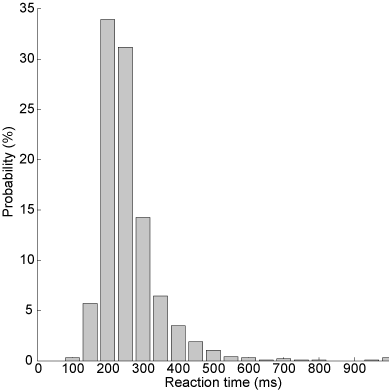
Fig. 60 Histogram of reaction times: the uncut version.#
Transformation - Promptness#
Often, simply taking the inverse of the reaction times (promptness) leads to a nicely symmetric, well-behaved Gaussian distribution. You can see that the inverse reaction time histogram (grey bars) corresponds nicely to a Gaussian distribution (black lines) with the same mean and standard deviation as the actual distribution in the figure below.
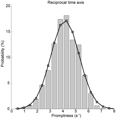
Fig. 61 Histogram of inverse reaction times / promptness. Bar diagrams indicate actual data, the black curve is the Gaussian with mean and standard deviation of the promptness data.#
\begin{lstlisting} rtinv = 1000./rt;
x = linspace(0,10,20); N = hist(rtinv,x); N = N./sum(N);
figure(2) h = bar(x,N); \end{lstlisting}
\begin{exercise}[Normal distribution] Does the promptness data look like it is normally distributed? Does it look like a Gaussian bell curve?
[label=(\alph*)]
Briefly explain why that might be according to the LATER model.
\mcode{Plot} a Gaussian density function with the same distribution properties as the promptness data. (What are the two parameters of a normal distribution? How can you determine these two parameters from the promptness data?). With \mcode{normpdf} you can derive the probability density (or you can fill it in with the equation for a Gaussian). (Remember: you need to make sure that the probabilities sum to 1). Does the data histogram resemble the estimated normal distribution curve?
And you do not even have to believe your own eyes: Test this for both the reaction time and promptness data, for example using \mcode{kstest} or \mcode{lillietest}. Please check out the help information on these tests. Note that kstest works on a “standard normal distribution” (\(\mu=0,\sigma=1\) , and so if you want to use this test, you have to “standardize” or “normalize” the data
\end{exercise}
Cumulative probability#
Now, histograms are problematic in the sense that their shape depends on the bin size and that they have an effectively arbitrary vertical scale. Cumulative histograms are normalized (running from 0 to 1 or 100 %), can represent all data without binning (continuous), and facilitate comparisons between data sets (see further below). In Fig. Cumulative probability of inverse reaction time. Every dot is an individual data point. Red markers indicate quantiles., \href{http://en.wikipedia.org/wiki/Quantile}{quantiles} at 1, 2, 5, 10, 20, 30, …, 70, 80, 90, 95, 98, and 99 % are plotted (red-faced circles) together with the actual data.
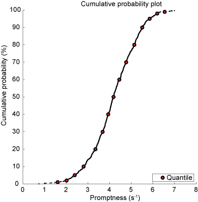
Fig. 62 Cumulative probability of inverse reaction time. Every dot is an individual data point. Red markers indicate quantiles.#
This is achieved first by determining the cumulative probability by sorting the data (\mcode{sort}) determine the rank for each data element (\mcode{1:n} with the number of elements n \mcode{n = numel(x)}).
\begin{lstlisting} x = sort(rtinv); n = numel(rtinv); y = (1:n)./n; figure(3) plot(x,y,’k.’); hold on \end{lstlisting}
Then we determine the quantiles (\mcode{quantile}).
\begin{lstlisting} p = [1 2 5 10:10:90 95 98 99]/100; q = quantile(rtinv,p);
h = plot(q,p,’ko’,’LineWidth’,2,’MarkerFaceColor’,’r’); \end{lstlisting}
Probit scale#
The cumulative Gaussian distribution results in a straight line by using a \href{http://en.wikipedia.org/wiki/Probit}{probit} scale for the ordinate. You can convert cumulative probability data in Matlab as follows:
\begin{lstlisting} cdf = q; myerf = 2*cdf - 1; myerfinv = sqrt(2)*erfinv(myerf); chi = myerfinv;
\end{lstlisting}
which is also done by \href{https://gitlab.science.ru.nl/marcw/biofysica/-/blob/master/bayesdataanalysis/functions/probit.m}{the probit m-function}.
\begin{lstlisting} x = -1./sort((rt)); n = numel(rtinv); y = probit((1:n)./n); \end{lstlisting}
This immediately allows you to visually check (don’t believe statistics, see for yourself) whether the distribution is actually Gaussian (otherwise, the data will not yield a straight line), the 50% point indicates the median of the distribution, and the standard deviation is directly related to the slope of the line. To adhere to the convention that long reaction times are on the right, the abscissa scale is also mirrored (data multiplied by -1).
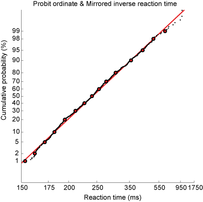
Fig. 63 Cumulative probability of inverse reaction time on a probit scale. Every dot is an individual data point. Red markers indicate quantiles. Red line indicates best linear fit.#
\begin{exercise}[Reciprobit plot] Plot the reciprobit figure.
[label=(\alph*)]
Does this seem like a straight line? When would you believe that the data does not fall along a straight line?
Fit a line through the data (linear regression) and plot. How does the slope and intercept of this line relate to the mean and standard deviation of the promptness?
make a function that you can reuse, that plots the data in a reciprobit figure and outputs the mean and standard deviation of the promptness and the slope and intercept of the linear fit.
\end{exercise}
Sound localization#
In Chapter chap:exc_soundloc, you engaged in hands-on learning by collecting data related to sound localization. You worked with various sound types: broadband, low-pass, and high-pass Gaussian White Noise bursts. Through this exercise, you discovered a key aspect of auditory perception: the ability to accurately localize sound depends significantly on its frequency content. Notably, sounds devoid of high-frequency elements proved challenging to pinpoint in the vertical plane. This observation ties into the insights gained from video clips in Chapter chap:auditorysystem. There, you learned that the cochlea, our primary auditory sensor, does not represent sounds spatially but rather tonotopically. Consequently, the auditory system has to decode spatial information from the complex spectrotemporal patterns of sound waves processed by the cochleae. For sound localization, humans depend on three critical cues (=information):
Interaural level differences
Interaural time differences
Spectral cues from the pinna (outer ear)
Building on these concepts, in the reaction times tutorial (Chapter chap:reactiontimes), we delved into how the speed of decision-making correlates with the amount of available information. This relationship is elegantly described by the LATER model and is supported by extensive experimental evidence.
\begin{exercise}[Application of the LATER Hypothesis] Let’s apply this knowledge to predict changes in reaction times:
[label=(\alph*)]
Discuss how the reciprobit line in the LATER model is affected by the influx of additional information. What does this imply about the workings of the LATER model?
For the three types of sounds used in your sound localization experiment, predict the variations in reaction times (promptness). Briefly explain your reasoning and hypothesize about the expected changes in the reciprobit plots.
\end{exercise}
\begin{exercise}[Analyzing Reaction Times in Sound Localization] Now, it’s time to test your hypotheses with real data:
[label=(\alph*)]
Import the sound localization data you’ve collected.
Apply your data analysis skills to graphically represent the data for each sound type.
Compute and record the mean and standard deviation for each sound and participant. Tip: Use \mcode{for} loops to streamline this process (other tip: just copy-paste if you have trouble implementing \mcode{for} loops).
Examine the results: Do the mean and standard deviations vary significantly across different sound types?
\end{exercise}
Visual Search Experiment#
The distribution of reaction times is a fascinating topic not only in the realm of sounds but also in visual perception. This section introduces a visual search experiment (Fig. The visual search paradigm used in this experiment.). Your task will be to quickly and accurately determine the presence of a red circle on the screen.
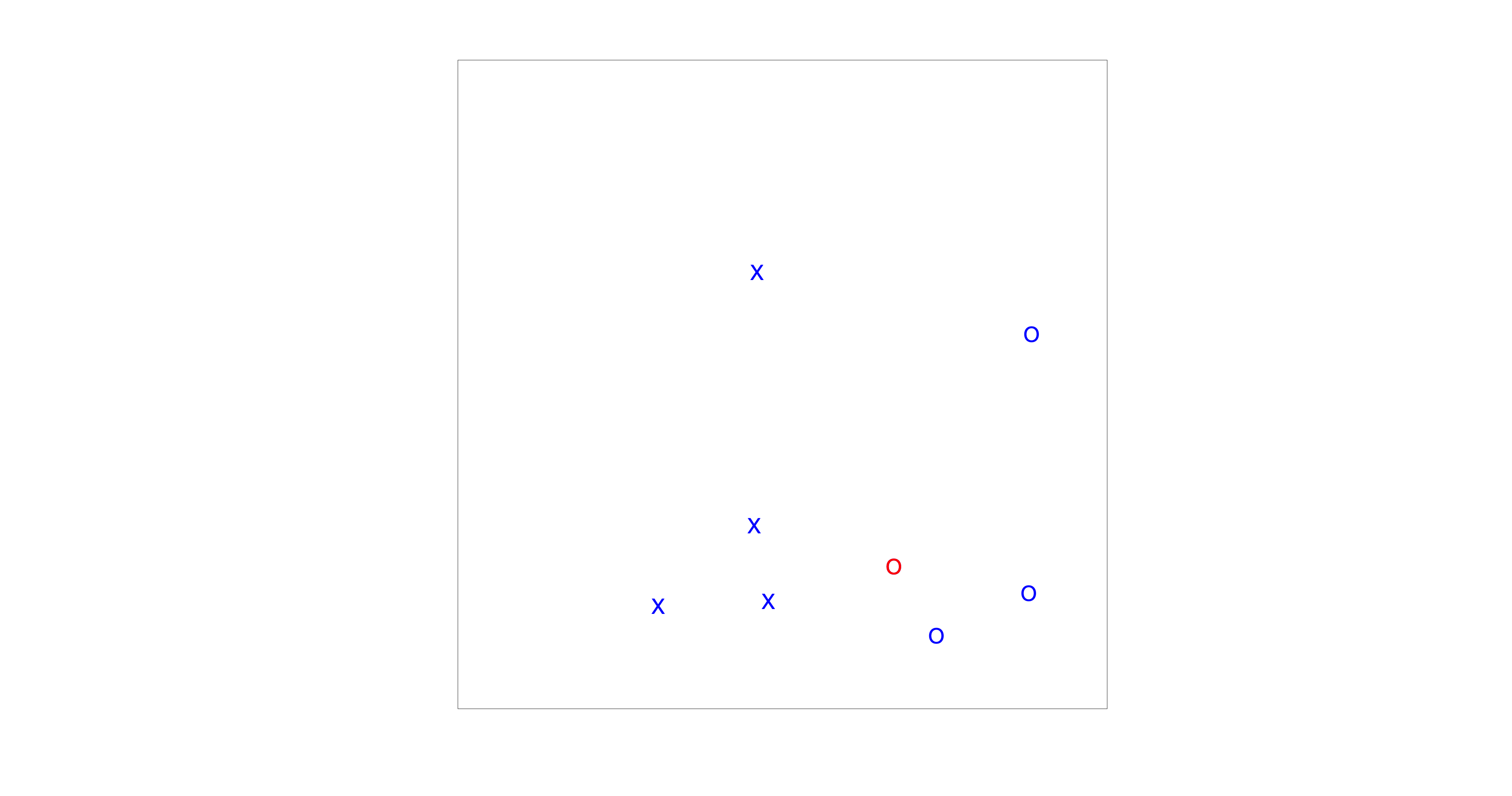
Fig. 64 The visual search paradigm used in this experiment.#
Before diving into the assignment, let’s familiarize ourselves with the Matlab environment and the data structure. If you want to start the experiment, you have to run \mcode{visualsearchexp} in Matlab. The resulting data will be saved in the same directory as the m-file. An example of a data file name is: \mcode{fname = ‘visualsearch-subject-001-date-18-12-23-time-16-05-11-setsize-16-search-popup.mat’} (Fig. Matlab’s current folder window displaying a mat-file from \mcode{visualsearchexp.m). To load a dataset in Matlab, either type \mcode{load(fname);} or click on the file in the current-folder window. This action will load several matrices, including:
RT: Reaction times (in seconds)
Tpresent: Whether the target (red circle) was present (0 - not present, 1 - present)
N: Number of targets and distractors (always 16 in this assignment)
Csearch: Conjunctive search type (irrelevant here as you will only conduct conjunctive searches)
KP: Key press responses (0 or 1, or other inputs)
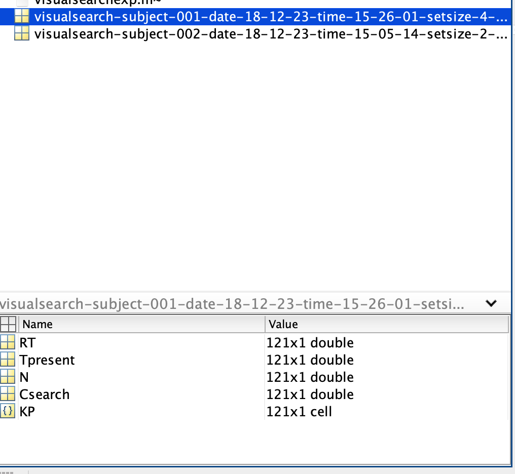
Fig. 65 Matlab’s current folder window displaying a mat-file from \mcode{visualsearchexp.m#
Note: Loading a dataset will overwrite any existing variables with the same names in your workspace.
\begin{exercise}[Analyzing Visual Search Data] Your task is to identify the presence of a red circle on the screen and to respond by pressing ‘0’ (absent) or ‘1’ (present). We will examine how reaction times differ under two distinct instructions: “respond as quickly as possible” and “respond as accurately as possible”.
[label=(\alph*)]
Formulate hypotheses on how the reaction time distributions may vary between the two instruction sets, based on the LATER model.
Perform the \mcode{visualsearchexp.m} task, prioritizing response speed.
Repeat the experiment, this time emphasizing accuracy in your responses.
Generate reciprobit plots for both data sets, and present them in one figure for comparative analysis.
Discuss the distribution of the data: Are they normally distributed, or do you observe any deviations from normality?
Filter out only the accurate responses using the provided Matlab code. \begin{lstlisting} KP = str2double(KP); sel = KP==Tpresent; RTcorrect = RT(sel); \end{lstlisting} Then, recreate the reciprobit plots with this refined data.
Also determine how accurate you are. \begin{lstlisting} accuracy = 100*sum(sel)/numel(sel); \end{lstlisting}
Apply a linear regression to each dataset and analyze the emerging patterns.
Summarize your observations and interpretations of the results.
\end{exercise}